Previously, I tested the "Meme generator" (Note: this visualization has been removed temporarily from the PowerBI website, but should reappear shortly). This time, I've chosen one that I hope to be useful to PowerBI users.
The Hierarchy Slicer is available from the PowerBI Gallery of Custom Visuals. Click on its icon to open up the Description and Download dialog. This dialog also offers the option to download a sample PowerBI file that demonstrates the use of the visual.
Testing
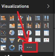
After examining the sample file, I decided to experiment with the new visual on my own. As with all custom visuals, when you open a new PowerBI report, the custom visual is not automatically available in the visuals list. To make it available you must first import it into the Visualizations bar by clicking on the " . . . " icon.
PowerBI will pop up a warning that you're attempting to load a custom visual and that you should only open it if you trust its author and source.
Click on Import to open a dialog to browse for the custom visual you just downloaded. It should be named, "HierarchySlicer.0.6.0.pbiviz" (or similar - they may have updated it since I downloaded it) and it should be located in the directory where you normally download files (unless you already moved it to another location).
After you select the custom visual file, PowerBI should pop up a message stating "The visual was successfully imported into this report." You can now use it in the report you currently have open.
The new custom Visual will be between the last standard Visual and the ". . ." symbol, as highlighted in yellow, below.
Please keep in mind that for every report where you wish to use a custom visual, it will have to be imported into the current report because PowerBI only keeps the custom visuals linked in the individual reports and not in the application itself.
For my first experiment with the Hierarchy Slicer, I used the Foodmart.mdb as the data source. I defined a hierarchy in the product_class table (product_family, product_department, product_category, product_subcategory), and set up a report for "Store sales by product hierarchy".
I then added the Hierarchy Slicer to my report and selected the Product Hierarchy for the "fields"
I then added the Hierarchy Slicer to my report and selected the Product Hierarchy for the "fields"
I could then click on various levels of data and observe the filtering of the products change as I made different selections.
Observations
The Good
- Easy to use
- Works great for small hierarchies
- Can configure either as "single select" or "multi-select"
The Bad
- The formatting option to switch the selection from single select to multi-select disappears after the first time the data is filtered, so choose wisely.
- The hierarchy levels cannot be collapsed, so when working with Date hierarchies, be sure to remove levels below Month from the Hierarchy Slicer otherwise finding dates in the middle of the hierarchy (such as a date 2 years from earliest and 3 years from latest dates) will be extremely challenging. The slicer will also produce an error when loading more than 5 years of dates.


