Showing posts with label Power BI. Show all posts

Thursday, May 12, 2022

3 Cloud Seeking Awesome Azure People

My company is hiring!!

3Cloud is a technology services firm helping clients transform their business through the power of the cloud. We leverage Microsoft Azure to help clients speed up innovation, operate more efficiently and be more responsive to their client’s needs. As a Microsoft partner, we specialize in Azure migration, cloud-scale custom application development, Internet of Things, analytics, and DevOps achieved through Azure-enabled infrastructure automation. 3Cloud is headquartered in Chicago with additional offices in Dallas and Tampa. 
Get your Azure on and join an awesome team with people like me. 


These are remote roles based in any US city.


Use the link below to see what roles are open for hiring. https://grnh.se/a6fd7f562us


Thursday, May 24, 2018

Power BI: M Query Basics (Part 2)

This is the second part of my series on Power BI M Query Basics. In Part 1, I defined M Query and talked about the structure of how an M Query query is written. If you haven't read the first part, go ahead and read it now....I'll wait.


OK, on to

M Query - the Second Part!


M Query Editor


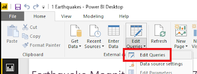
Open up a Power BI report in Power BI desktop. On the Home ribbon, click on the Edit Queries > Edit Queries to open up the Query Editor.


In Query Editor, you can get to the M Query behind one of your queries by clicking on Advanced Editor either on the Home tab or on the View tab of the editor. (it's available in both locations)


Once you have Advanced Editor open, you can edit the M Query associated to the selected query.
The first thing that you will notice about the built-in M Query editor is that it doesn't have any context highlighting, matching brackets are not highlighted, and syntax errors are extremely difficult to track down. Editing M query in here is not for the faint of heart - most of us are very thankful that the Query Editor user interface can auto-generate about 90% of all of the M Query code that will be needed.

Thankfully, it's not the only option. 

M Extension for Notepad++

 
First up is the M Extension for Notepad++. I'm a big fan of Notepad++. It's lightweight, loads fast, and has context highlighting available for most programming languages. The official plug-in page for Notepad++ doesn't yet have a link for a fully completed extension, but you can visit Lars Schreiber's blog for instructions to set up your own M language highlighting (you only have to do it once, then it's there forever as a language choice in Notepad++).

The above screenshot shows the same "May Earthquakes" M Query except within Notepad++. Already you can see that pasting your M Query into Notepad++ makes it so much easier to understand and edit. 

M Extension for Visual Studio Code

 
A second editor to try for working with M Query is Visual Studio Code. This is a free application available from the Visual Studio Code site. Once you've installed Visual Studio Code, click on the Extensions button and perform a search for Power (full name is Power Query M Language).
Hit install and it will be ready for use. What's really lovely about Visual Studio Code is that the M Query Extension provides intellisense - when you start to type it pops up a context sensitive list of possible M Query functions which could apply to what you are typing.
This is handy for medium-weight development where you are typing in a substantial amount of code or making major changes and prefer to have some assistance with syntax. You will have to paste the code back in Power BI Advanced Editor to test it.

Power Query SDK for Visual Studio

 
For serious M Query writers, Visual Studio now has a Power Query SDK. This add-in for Visual Studio 2015 and Visual Studio 2017 allows developers to create Visual Studio projects using M Query (aka "Power Query). There are two types of projects available:
The Data Connector Project is intended for creating additional Power Query extensions, and the PQ file is for writing M Query queries like we've been working with.

Create a new PQ file project and paste in the M Query from your Power BI Advanced Editor. The PQ file projects can only handle one PQ file per project, so don't try to add a second PQ file. If the M Query contains a syntax error, Visual Studio highlights the error with the same red underlining as it does with any other programming language. It also will provide intellisense and bracket highlighting to make coding easier.

But wait...there's more! 

Visual studio also allows execution of the M query. To run click on the "Start" button (the usual debugging button). 
The first time you click on "Start", a dialog will pop up requesting credentials for the data source. Once credentials are set, close the Error dialog and click "Start" once more. The window will pop up again, but this time data should load. 
This will certainly save time since it won't be necessary to copy the M Query back into Power BI Advanced Editor until all modifications have been completed.

 That concludes Part Two of the M Query blog series. Join me in Part Three when I walk through a demonstration of writing M Query without using the Power BI Query Editor User Interface to auto-generate the M Query.


Tuesday, April 3, 2018

Power BI: M Query Basics (Part 1)

When you work with Power BI, you'll find that there are two languages to work with: DAX and M. Since most of the M query that you will regularly use is automagically (*that's not a real word, but it SHOULD be one) written by the Power BI user interface, the majority of Power BI developers focus on becoming proficient in DAX and really only look at M when they're stuck in a situation that requires that they learn it.

This M&M is a mashup of chocolate
 and pretzels
So, what exactly is M?

Some people think M is for "Microsoft".

Not quite.

According to the Microsoft Power Query M Reference,  "The Power Query M formula language is optimized for building highly flexible data mashup queries. It's a functional, case sensitive language similar to F#."

Generally speaking, most Power BI professionals settle upon saying that M is for 'Mashup'.

Now, when I heard that, the first thing I thought of was the orange pretzel M&M guy - he's a mashup of a favorite chocolate candy with pretzel and maybe some other stuff. Quite enjoyable, but not your standard or traditional M&M - just like M Query.

M is a functional script language with a step by step language structure used for data preparation. With it, one can transform or combine data sets, pivot, unpivot, split columns,  add or remove columns, remove unwanted characters, modify data types and perform data manipulations, among other things.

In Power BI, M Query can be automagically generated within its Query Editor user interface. The "Applied Steps" listing there summarizes all of the sequential M Query steps that have been applied to the current query, allowing users who aren't proficient in M Query to quickly view the changes made to the data set and to modify the changes without intimate knowledge of the M Query syntax.

Let's take a look at the structure of an M Query. You can access the M Query code from the Query Editor in Power BI by clicking on "Advanced Editor".

Here is an example of a Power BI M Query:

In Dark Blue, we have the "let" expression. This is equivalent to our SQL "CREATE PROCEDURE" declaration - it demarks the beginning of the series of steps used to transform the data into the final table to be used in Power BI.

Next, in Purple, we have the "in" expression. The Named Expression which follows "in" is the Output or final result of our M query. This defines the values that are seen in the grid view within the query editor.

In Aqua, we have the Named Expressions and variables. Each Step is a Named Expression which functions as a label to identify that step. Steps that are a single word may be declared by simply using the word alone, however, step names which contain spaces must be marked by using # and then enclosing the words within ". An example would be #"Renamed Columns"... Note that Source, which is only one word, does not need either the # or the " surrounding it.

In Green, we have the M Functions. These are the transformations performed upon the data set and the commands used to shape or mashup the data as needed by the final Power BI report.

In Black are the references to the previous steps. If you check each line, you will see that the Previous Step reference (in black) exactly matches the Named Expression (in Aqua) in the line above it. This helps demonstrate the step by step nature of the language - each successive step references and builds upon prior steps.

 There are a few other types within the M Query syntax, such as strings in Brick Red, data types and key words, but generally speaking the above summarizes the M Query syntax.

Friday, June 24, 2016

Power BI: Custom Visuals - Hierarchy Slicer

I've been playing with PowerBI recently and have discovered their Gallery of Custom Visuals. I decided to try a few to see what they do and determine whether they'd be useful in future PowerBI projects.

Previously, I tested the "Meme generator" (Note: this visualization has been removed temporarily from the PowerBI website, but should reappear shortly). This time, I've chosen one that I hope to be useful to PowerBI users.

The Hierarchy Slicer is available from the PowerBI Gallery of Custom Visuals. Click on its icon to open up the Description and Download dialog. This dialog also offers the option to download a sample PowerBI file that demonstrates the use of the visual.


Testing

After examining the sample file, I decided to experiment with the new visual on my own.

As with all custom visuals, when you open a new PowerBI report, the custom visual is not automatically available in the visuals list. To make it available you must first import it into the Visualizations bar by clicking on the " . . . " icon.

PowerBI will pop up a warning that you're attempting to load a custom visual and that you should only open it if you trust its author and source.
 Click on Import to open a dialog to browse for the custom visual you just downloaded. It should be named, "HierarchySlicer.0.6.0.pbiviz" (or similar - they may have updated it since I downloaded it) and it should be located in the directory where you normally download files (unless you already moved it to another location).

After you select the custom visual file, PowerBI should pop up a message stating "The visual was successfully imported into this report."  You can now use it in the report you currently have open.

The new custom Visual will be between the last standard Visual and the ". . ." symbol, as highlighted in yellow, below.
Please keep in mind that for every report where you wish to use a custom visual, it will have to be imported into the current report because PowerBI only keeps the custom visuals linked in the individual reports and not in the application itself. 

For my first experiment with the Hierarchy Slicer, I used the Foodmart.mdb as the data source. I defined a hierarchy in the product_class table (product_family, product_department, product_category, product_subcategory), and set up a report for "Store sales by product hierarchy".

I then added the Hierarchy Slicer to my report and selected the Product Hierarchy for the "fields"

I could then click on various levels of data and observe the filtering of the products change as I made different selections. 

Observations

The Good

  • Easy to use
  • Works great for small hierarchies 
  • Can configure either as "single select" or "multi-select"

The Bad

  • The formatting option to switch the selection from single select to multi-select disappears after the first time the data is filtered, so choose wisely.
  • The hierarchy levels cannot be collapsed, so when working with Date hierarchies, be sure to remove levels below Month from the Hierarchy Slicer otherwise finding dates in the middle of the hierarchy (such as a date 2 years from earliest and 3 years from latest dates) will be extremely challenging. The slicer will also produce an error when loading more than 5 years of dates.

Conclusion

While the Hierarchy slicer is an excellent concept, because it lacks the ability to collapse the hierarchies, I think I'd rather use multiple instances of the standard "Slicer" visual to handle the filtering of the lower level hierarchy choices.


Tuesday, June 14, 2016

Power BI: Custom Visuals - "Meme Generator"

I've been playing with PowerBI recently, and have discovered their Gallery of Custom Visuals. I decided to try some to see what they do and determine whether they'd be useful in future PowerBI projects.

The one that caught my eye first was the "Meme generator". This was clearly created as an exercise in creating a new Visual. It shows that not all of the Visuals necessarily have to be "business ready", just fun or useful in some way. The "Meme Generator" is brilliant in its simplicity. All one can do with it is alter the text at top & bottom and choose the image that links to it.

As you can see to your left, I've tested the Meme Generator with an image of the famous "Steampunk Bacon Cat" embroidery from Urban Threads, a company that produces wildly awesome machine embroidery.

To obtain any of the custom visuals, visit the PowerBI Gallery of Custom Visuals, and click on the one that draws your interest. A dialog box with a description of the custom visual will pop up. The dialog box will also provide a download button and (at least in the case of the Meme Generator) a button to download a sample PowerBI file with examples of the custom visual in use.

After you've downloaded the "Meme Generator" custom visual and its sample file, double-click on the sample file to open it in PowerBI.
The "Meme Generator" custom visual sample file contains three examples of the Meme Generator in use.  If you want to try creating your own Meme, click on the Cat icon (next to the "R" icon as seen below:) 

This will create a "Meme template" for you, which conveniently has instructions for how to configure it.

In the Visualizations section, you will see the options for configuration. 

Change the Top Text & Bottom Text to words appropriate to your Meme, then enter the URL of the image you wish to use for the meme. You may also add a title, change the background, or add a border. You can take a screen shot of the image - I used the "Send to OneNote" screen clipper to select the image then paste it into Paint so I can save it as an image ready to be posted. 


Tuesday, April 26, 2016

Power BI Experiments

I’ve recently discovered Power BI. Basically, it’s the child of Power Pivot and SQL Reporting Services, but without Kryptonite to slow it down. You can connect to all kinds of datasources – Excel, SQL, Hadoop, folders ….and 55+ other data sources – and then perform analyses of the data therein. Microsoft has even allowed developers to publish / create new “visualizations” (charts, graphs, maps, etc.) for users to adopt for their data analysis.

I decided to give it a try, and used my Wine Cellar Excel spreadsheet as the test data set so I could more easily recognize any trends that the Visualizations pointed out.

I first evaluated my collection by Country & Region by Quantity of Wine (in ml). The light blue circles correspond to “France”, and the pink is “Portugal”…Somehow Burgundy, France wound up near New York…and our Douro, Portugal (Port!!) sat near the Great Lakes. This I cannot explain.. .I had to edit “Rhone, France” to “Lyon, France” to move it from somewhere in Asia to France. I’m not sure how it was handling the mapping, but I guess it cannot handle Region names.

The only way I could get the mapping to look better was to look up the regions and set them to specific cities in each country. I guess that the mapping program cannot understand Regions (Bordeaux, Burgundy, Cotes D’Or, Willamette Valley, Douro Valley, etc.). Therefore, if one wishes to use Power BI to display data on maps, then the locations listed must be City names, and not Region names, nor a mix of Cities and Regions as I had in my Wine List spreadsheet.

I then tried and analysis of Quantity (in ml) by Year and Appellation. This provided the expected results: we own a LOT of Chateauneuf du Pape 2005 (Pink in below graph).
I also evaluated it using the pie chart to see how that turned out.

Again, it’s obvious what we like to stock in our wine cellar (light blue is all 2005, and the majority is Chateauneuf du Pape), but it also shows that Power BI makes it extremely simple to illustrate that fact through the visualizations it provides - I spend only a few minutes to generate these charts from my data.

All in all, I’d say that Power BI is very useful for quick and efficient analysis of any dataset where a graph or chart would best illustrate the relationship of data elements within it.

Resoved: Error Creating Storage Event Trigger in Azure Synapse

My client receives external files from a vendor and wants to ingest them into the Data Lake using the integration pipelines in Synapse (Syna...