I decided to give it a try, and used my Wine Cellar Excel spreadsheet as the test data set so I could more easily recognize any trends that the Visualizations pointed out.
I first evaluated my collection by Country & Region by Quantity of Wine (in ml). The light blue circles correspond to “France”, and the pink is “Portugal”…Somehow Burgundy, France wound up near New York…and our Douro, Portugal (Port!!) sat near the Great Lakes. This I cannot explain.. .I had to edit “Rhone, France” to “Lyon, France” to move it from somewhere in Asia to France. I’m not sure how it was handling the mapping, but I guess it cannot handle Region names.
The only way I could get the mapping to look better was to look up the regions and set them to specific cities in each country. I guess that the mapping program cannot understand Regions (Bordeaux, Burgundy, Cotes D’Or, Willamette Valley, Douro Valley, etc.). Therefore, if one wishes to use Power BI to display data on maps, then the locations listed must be City names, and not Region names, nor a mix of Cities and Regions as I had in my Wine List spreadsheet.
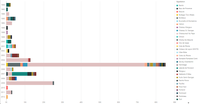
I then tried and analysis of Quantity (in ml) by Year and Appellation. This provided the expected results: we own a LOT of Chateauneuf du Pape 2005 (Pink in below graph).
 I also evaluated it using the pie chart to see how that turned out.
 Again, it’s obvious what we like to stock in our wine cellar (light blue is all 2005, and the majority is Chateauneuf du Pape), but it also shows that Power BI makes it extremely simple to illustrate that fact through the visualizations it provides - I spend only a few minutes to generate these charts from my data.
All in all, I’d say that Power BI is very useful for quick and efficient analysis of any dataset where a graph or chart would best illustrate the relationship of data elements within it.


No comments:
Post a Comment